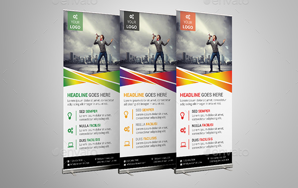
When you’re designing a banner, whether it’s pull up banners, pop up banners, personalised banners, or roller banners – your goal is to make an impact – your goal is not just to get your message across, but to make sure it is understood and appealing to your target demographic. Since most people will only glance at your banner (and hence, you have about a second or less to get the attraction of the passer-by, and less than 5 seconds to get your message across), the major thing to consider is visual attractiveness. It’s no joke – visually speaking, you need to be perfect.
Fonts have a lot to do with this, and it’s not always easy to pick the right one. If you’re designing a banner, then this one is for you: here are the best ideas on fonts for best and most effective roller banner.
1. Understand your brand
Your banner has limited space, and the golden rule is (and always will be): less is more. Choose your font very carefully; the wrong kind of font can easily send the wrong message. Make sure people can read your message clearly from a distance, and although styling may create a good impression, it’s not worth it if people have to squint their eyes to read it well.
2. Go bold
Never be afraid of going bold, and never hesitate to go big. You have limited space, so you may hesitate, but don’t – it’s better to have a few words that can clearly be read and understood, rather than a whole sentence whereby people have to pause to understand it. Be bold, be proud, and be clear.
3. Don’t overdo it
Don’t go overboard with the fonts – using only one is boring, but using more than two is overdoing it. Have one font for your headline, and another for additional messages. Two fonts are ideal.
4. Pick the colour carefully
You want your fonts to have a nice colour – and you want a good contrast for optimal readability.
5. Don’t SHOUT
Unless you want to draw attention to a particular thing, don’t use capital letters. It actually slows reading down and creates negative emotions.
The art of designing a banner for banner printing is not so much based on what fonts or colours you use, it’s about understanding how your target demographic will react to it. If there’s something that you want to stress, then by all means, use capital letters in bright colours – but make sure it’s worth noting and that the colour you choose will appeal to your target demographic. Your font will say a lot about you; make sure you do a test run for your roller banner’s design, and, above all, ensure your message stays clear at all times.


